
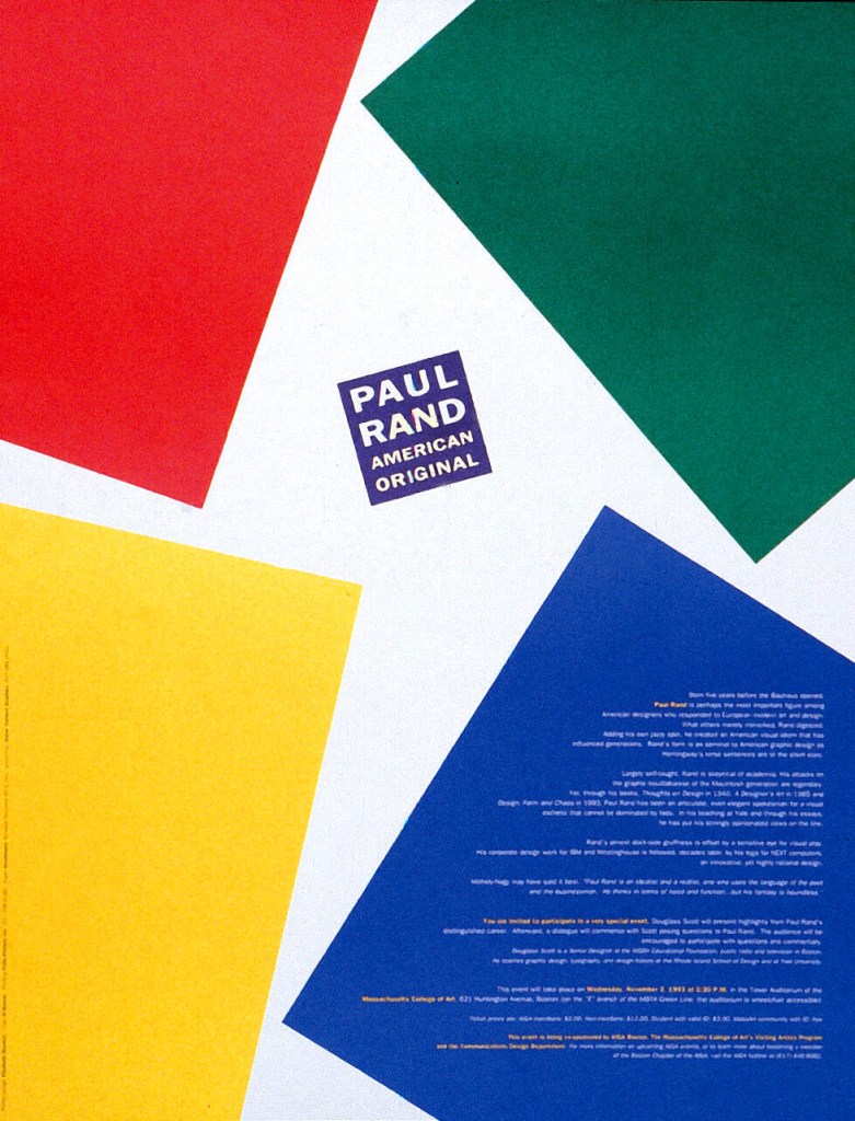
When I first discovered Paul Rand’s work, what drew me in immediately was his use of primary colors—vibrant reds, yellows, blues, and greens that felt joyful, modern, and timeless. These colors reminded me of childhood, but in Rand’s hands, they became elevated—elegant, professional, and powerful.
It made me wonder: Was he inspired by the Bauhaus? After all, that legendary movement celebrated geometric shapes, bold typography, and the same primary palette. The short answer? Yes—but Rand’s genius was in how he transformed those ideas into something uniquely American, playful, and commercially successful.
A Quick Look at Paul Rand
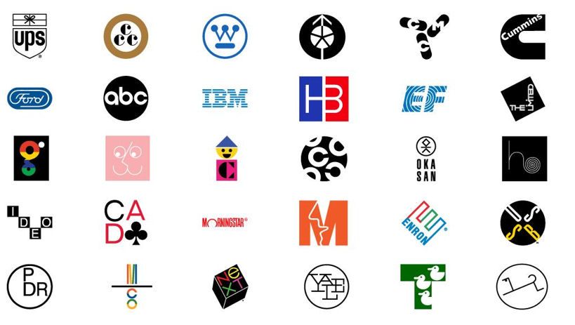
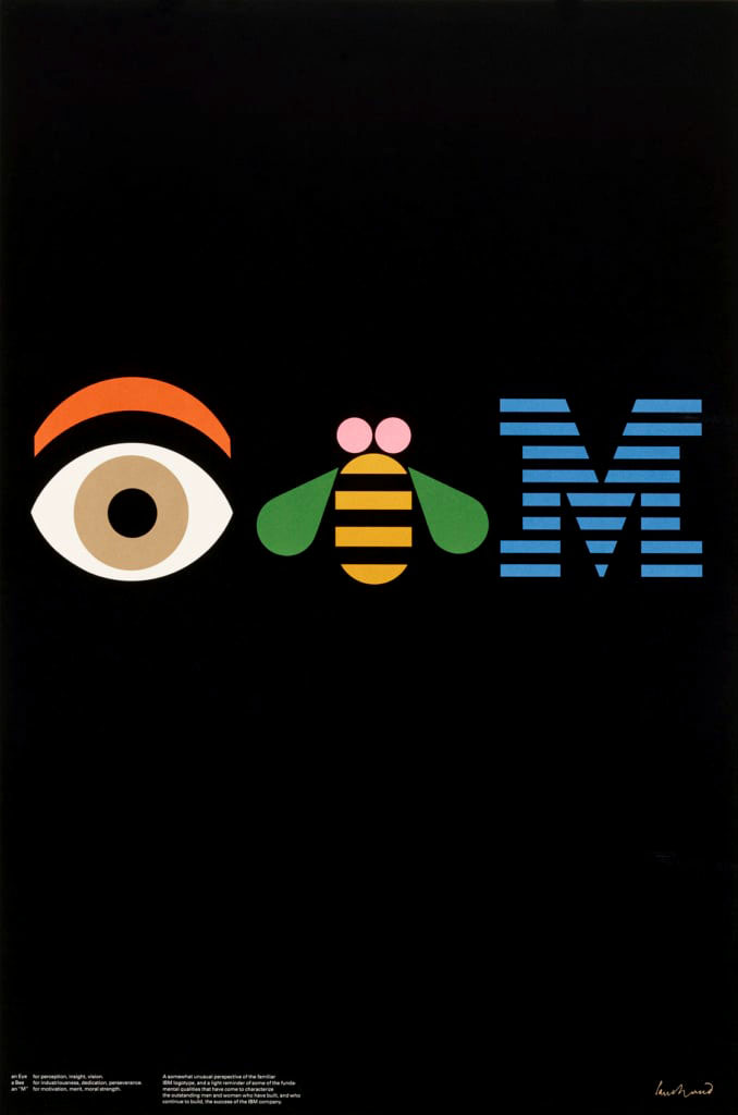
Paul Rand (1914–1996) was one of the most influential graphic designers of the 20th century. He’s best known for designing timeless corporate logos such as IBM, ABC, UPS, and Westinghouse—identities that still feel modern decades after they were created.
But what made Rand special wasn’t just the logos. It was his design philosophy: the belief that simplicity, clarity, and visual wit could coexist with corporate goals. He believed design should serve a purpose—but that purpose could also be joyful, human, and intelligent.
Primary Colors: A Signature Language
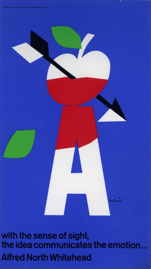
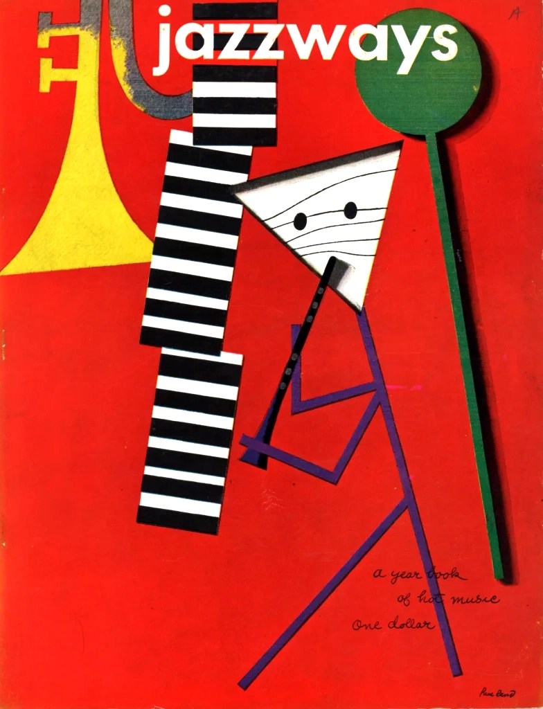
Rand’s use of primary colors—red, yellow, blue, and green—wasn’t just a stylistic choice. It was a statement. These colors, often associated with childhood, building blocks, or schoolbooks, gave his designs an approachable, playful character. But under his direction, they were precisely arranged, balanced, and sophisticated.
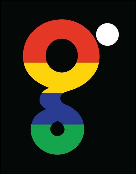
The color palette you see today in the Google logo—bright yet softened versions of the same primaries—echoes Rand’s spirit. Even when the tones are slightly less saturated, the energy and clarity remain. It’s a language that feels universal.
Bauhaus Roots and American Optimism
Rand was deeply influenced by the European avant-garde, especially Bauhaus, Constructivism, and De Stijl. The Bauhaus, in particular, emphasized:
- Geometric simplicity
- Functionality
- Bold typography
- Primary colors
But Rand didn’t copy these ideas—he adapted them. Where Bauhaus could feel rigid or theoretical, Rand added warmth and wit. His book covers and advertising work often featured collages, textures, childlike drawings, and asymmetry—all guided by a deep understanding of visual balance.
He once said, “Design is the silent ambassador of your brand.” And through his quiet, colorful designs, he gave voice to some of the world’s most recognizable companies.
The Power of Play
What I admire most in Rand’s work is the playfulness. He never made design feel cold or mechanical. Even in corporate work, you can sense the childlike joy—the play of shapes, the dance of color, the simplicity that took real complexity to achieve.
His logo for IBM, with the striped letters, is both functional and poetic. His ABC logo feels like a child could have drawn it—but no child would have gotten the proportions or alignment quite so right.
Rand believed in using design to communicate ideas clearly, but he also believed in beauty. That balance of utility and emotion is what makes his work still resonate today.
Final Thoughts
Paul Rand didn’t just use primary colors—he made them sing. His approach to design was deeply influenced by European modernism, but reimagined through an American lens of optimism, clarity, and play. His work reminds us that simple doesn’t mean boring—it means intentional.
And if you’ve ever looked at a Google Doodle or admired a logo that made you smile, you’ve seen the ripple effect of Paul Rand’s philosophy in action.

Response to “Paul Rand: the Mastermind Behind Modern Graphic Simplicity”
[…] Paul Rand Corporate PalettePaul Rand’s Corporate Palette is known for its bold, clear, and highly functional colors that […]
LikeLike