The Rise of a Typeface That Became Synonymous with Elegance
Walk past a high-end boutique, flip through the glossy pages of a luxury fashion magazine, or scroll through a prestige brand’s website—and chances are, you’ll come across Bodoni. With its dramatic contrast, sharp serifs, and refined geometry, Bodoni has become the font of luxury. But why? How did this centuries-old typeface rise to such iconic status in modern high fashion and luxury branding?
Let’s rewind a bit.
A Typeface Born in the Age of Refinement
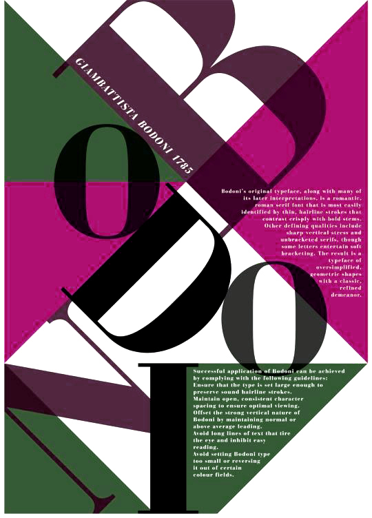
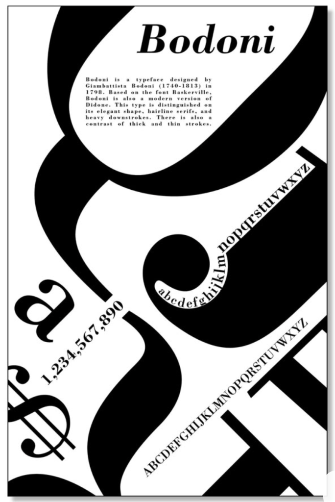
Bodoni was created in the late 18th century by Italian typographer Giambattista Bodoni. He was inspired by the work of French type designer Firmin Didot, but took the concept of high contrast between thick and thin strokes even further. The result was a neoclassical typeface that broke away from the organic feel of earlier designs like Garamond or Caslon.
Bodoni’s type was precise, architectural, and unapologetically modern for its time. It embodied the Enlightenment ideals of reason, structure, and beauty—all perfectly aligned with the values of sophistication and cultural prestige.
The Vogue Connection: A Turning Point
Fast forward to the 20th century. In the 1950s, Vogue magazine began using Bodoni for its headlines, establishing a visual language that whispered (and sometimes shouted) luxury. The typeface became so strongly associated with high fashion and editorial elegance that it almost felt like part of the runway itself.
This is when the magic happened: Bodoni, once just a neoclassical typeface, became a status symbol. The editorial world—fashion magazines, beauty campaigns, even luxury travel publications—embraced Bodoni as a way to signal refinement, exclusivity, and cultural cachet.
Luxury Loves Drama
Bodoni’s high contrast between thick and thin strokes creates a dramatic effect that feels both bold and refined—exactly the kind of tension luxury brands love to play with. Its vertical stress and crisp serifs give it a sense of formality and poise. And because it’s not overly ornate, it maintains a minimalist elegance that works beautifully across mediums—from print to digital.
Whether you’re looking at the logos of luxury brands like Valentino, Vogue, or high-end perfume packaging, Bodoni offers a timeless yet assertive identity. It doesn’t scream—it commands attention.
A Signifier of Status
In branding, fonts are more than letters—they’re emotional triggers. Bodoni’s association with elegance and heritage allows brands to borrow a sense of legacy and prestige. By using Bodoni, a brand instantly taps into decades of visual luxury storytelling. It creates a bridge between classic refinement and modern style.
Think of it this way: Helvetica might be democratic, accessible, and modern. Bodoni is aristocratic, aspirational, and eternal.
Still Relevant Today?
Absolutely. Despite evolving trends in type and logo design, Bodoni has retained its power in the luxury market. Many brands now use modern revivals or variations like ITC Bodoni or Didot (a cousin typeface with similar characteristics). But the essence remains the same: using Bodoni is shorthand for sophistication.
In a digital age where visual branding is more important than ever, Bodoni’s ability to convey elegance at first glance keeps it very much alive. It’s not just a font—it’s a statement.
The luxury market didn’t just “choose” Bodoni. It fell in love with it. The typeface’s roots in Enlightenment ideals, its iconic status in fashion publishing, and its sheer aesthetic drama make it an ideal vehicle for conveying prestige and refinement.
So next time you see a Bodoni headline or logo, know that it’s not just about the font—it’s about what the font represents.

Leave a comment