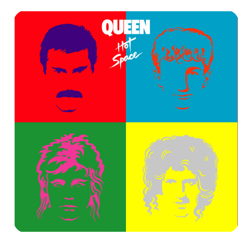
There are some album covers that go beyond branding or aesthetics — they become icons. For me, Queen’s Hot Space (1982) is one of those. Honestly? It’s a cover I wish I had designed in my career. It hits that sweet spot between art and pop culture, and it does it in a way that still feels fresh decades later.
Designed by Queen’s longtime art director Richard Gray, the cover is a bold celebration of minimalism, Pop Art, and Warhol-inspired visuals. It should honestly be hanging in a museum — and maybe one day it will.
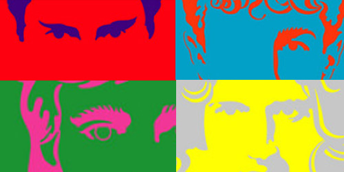
The design features stylized portraits of Freddie Mercury, Brian May, Roger Taylor, and John Deacon, each reduced to abstracted contour lines, with faces placed in separate squares filled with vibrant, high-contrast RGB colors. It’s simple, graphic, and completely unforgettable.
Every time I look at it, my designer heart skips a beat — like the rhythm of Queen’s track Cool Cat (go listen to it if you haven’t). I can almost hear the synth groove as I stare at the colors:
“Feeling the beat in my heaaaart…”
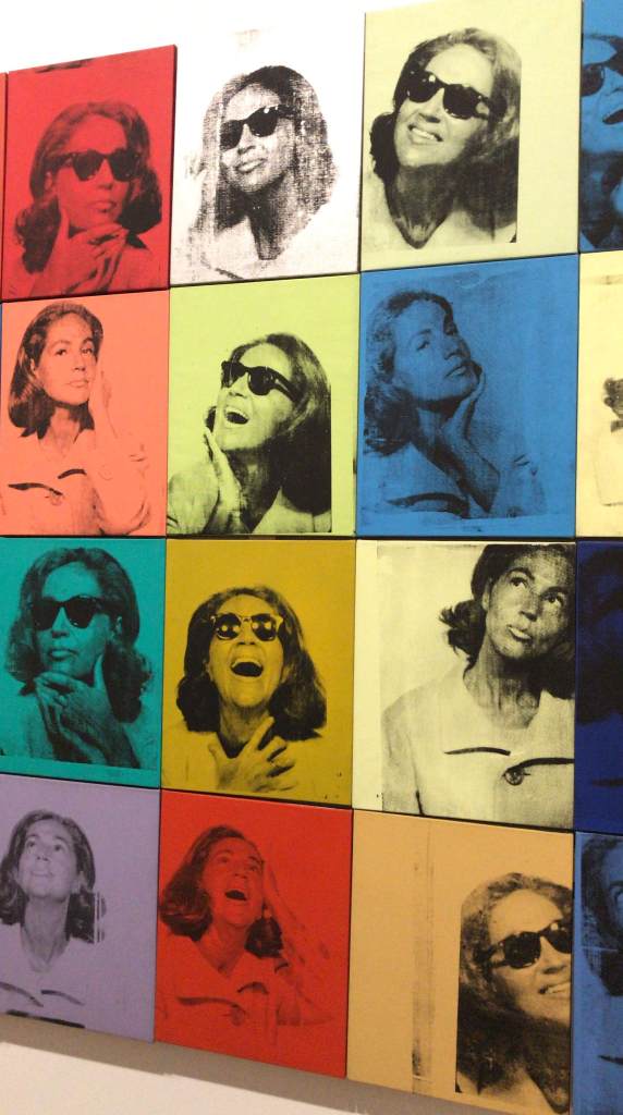
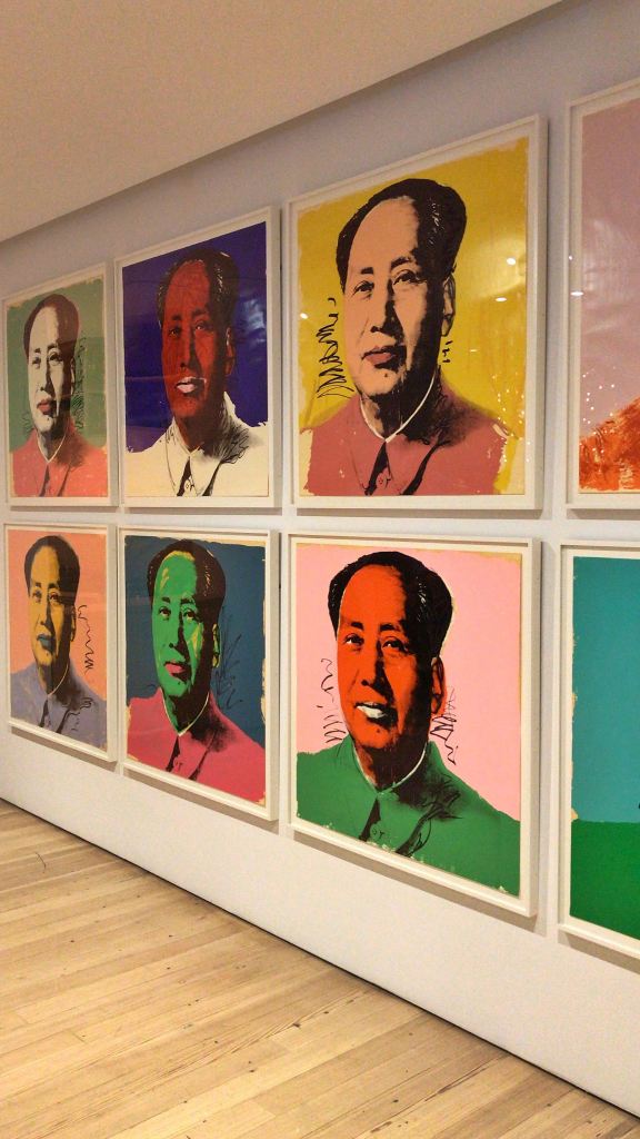
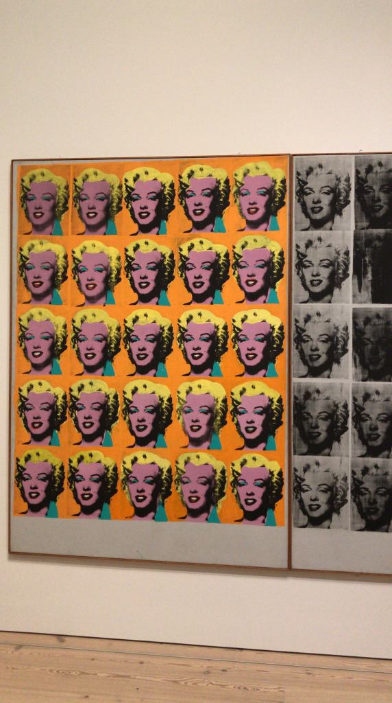
It’s impossible not to see the influence of Andy Warhol’s silkscreen portraits, especially his iconic Marilyn Monroe series. The echoes of pop culture and fine art blend so well here. Richard Gray was clearly channeling Warhol — and to be honest, so do I. Always.
I’ll be posting some shots I took at the Andy Warhol exhibition I visited in NYC on December 28, 2018 — a day I remember vividly. Seeing those works up close reminded me how much graphic design is part of the art world, not just commercial work.
In the end, Hot Space is more than an album cover to me. It’s a reminder of why I fell in love with design in the first place:
bold choices, clear vision, and timeless execution.