One of my all-time favorite artists is Piet Mondrian, a Dutch painter who managed to shift the entire visual language of modern art — with nothing more than a few bold lines and primary colors.
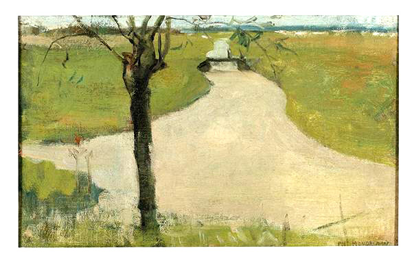
What many people don’t know is that Piet Mondrian didn’t start his career with minimalism — with grids and bold colors. In fact, he began by painting landscapes: trees, windmills, and Dutch countryside scenes, filled with soft light and movement. His early works were heavily influenced by Impressionism and, later, Cubism.
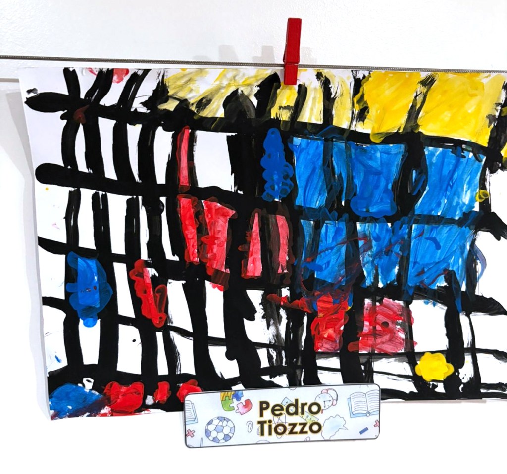
It’s a reminder that even Mondrian had a beginning.
First you start. Then you evolve.
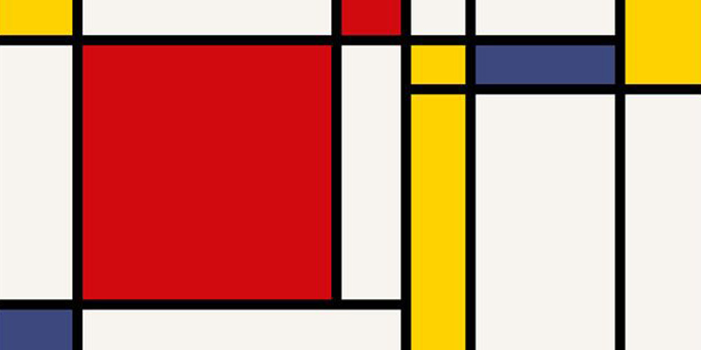
As his style matured, those influences gave way to something radically different. In 1917, he co-founded the De Stijl movement (which means The Style), embracing pure abstraction, order, and harmony. Think: red, blue, yellow, black, and white — arranged with surgical precision inside black grids.
But to call Mondrian’s work “simple” would be to miss the point. His use of primary colors and geometric form was revolutionary. So revolutionary, in fact, that it became iconic — to the point where any design using those colors and shapes feels like Mondrian. I often joke that Mondrian “owns” primary colors. You see a red, blue, and yellow combo, and suddenly it’s: Is that Mondrian?
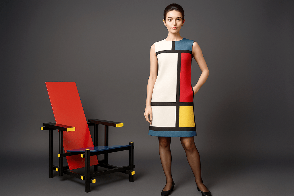
This is what fascinates me most — how his visual language has crossed over into fashion, furniture, and design. Look at the iconic Yves Saint Laurent dress from 1965, printed on the cover of Vogue, or the famous Gerrit Rietveld Red and Blue Chair. The chair isn’t a painting, and yet somehow it’s Mondrian. That’s when you know an artist transcended the canvas.
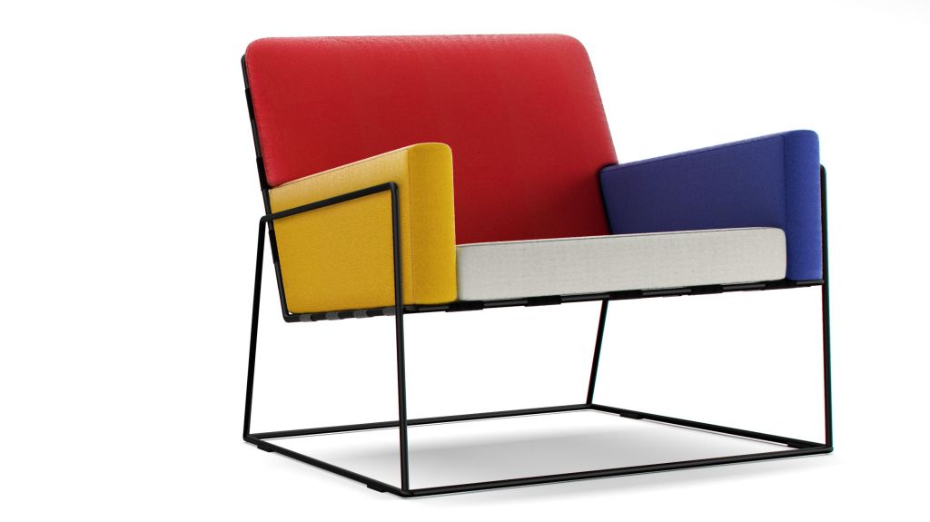
Even modern reinterpretations of armchairs — minimalist, geometric, almost Bauhausian in style — manage to feel unmistakably Mondrian, just by using primary colors. You look at the chair and instantly think: That’s Mondrian.
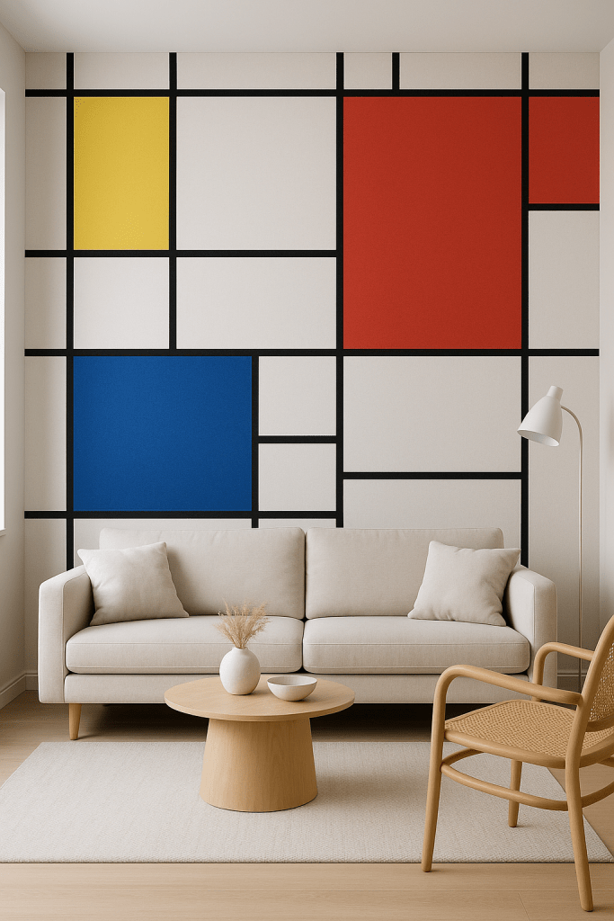
I’ve even imagined painting a whole wall in my home inspired by one of his works. Not a framed print — an entire Mondrian wall. The image lives in my mind vividly, full of bold lines and saturated blocks of color.
Which leads me to reflect…
Mondrian Everywhere?
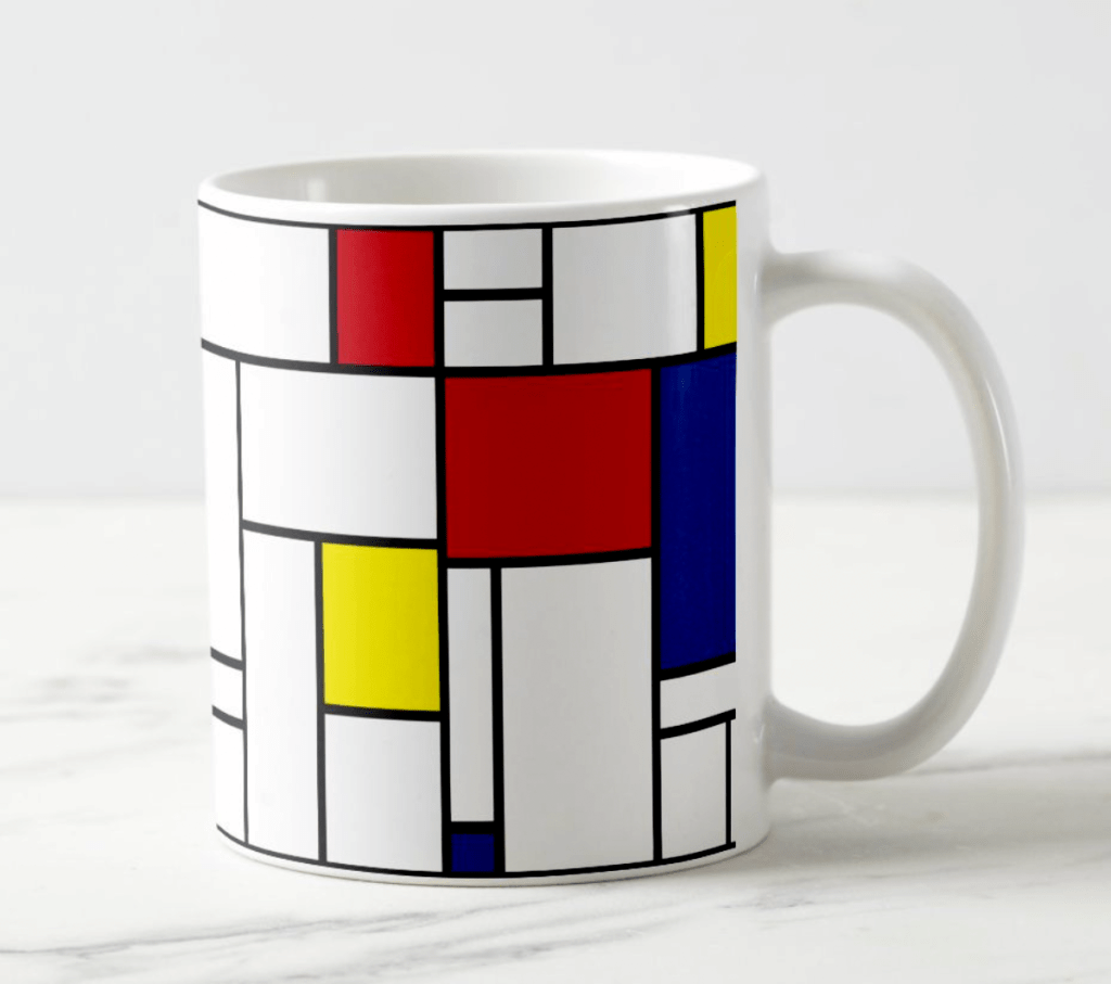
Here’s where things get tricky. While I love seeing Mondrian’s influence in the world, part of me is conflicted. There’s a fine line between homage and commodification. When genius design is overused, it can lose some of its magic. We’ve seen this with many artists whose work becomes a branding tool — and it’s a bit heartbreaking. I hope Mondrian’s legacy continues to inspire thought and discipline, not just packaging. A Mondrian mug — is it a yes, a no, or a huge no for you? This is where art begins to intertwine with graphic design.
What once was magic can become tragic.
Mondrian didn’t just paint. He designed a system — a way of seeing. It was never about the colors or the lines. It was about balance, purity, and expression stripped to its essentials.
“Art is higher than reality and has no direct relation to reality.” — Piet Mondrian