
Have you ever looked at an image and instantly seen one thing… only to realize seconds later there’s something else hidden right in front of you? That’s the magic of Figure/Ground, one of the most fascinating principles in Gestalt psychology.
In simple terms, figure/ground explains how our brain separates what is the main subject (figure) from what fades into the background (ground). Most of the time this happens automatically. But then artists and designers come along and completely mess with that logic—in the best way possible.
They create visuals that force your brain to pause, switch perspectives, and sometimes question what you’re even looking at. And honestly? That’s what makes it so addictive.
A closely related concept—often confused with Figure/Ground—is negative space. While they can overlap, they’re not exactly the same thing. Negative space happens when designers intentionally use empty areas to reveal a secondary shape or hidden message. Think of the World Wide Fund for Nature panda logo or the hidden arrow in the FedEx logo.
The difference? Figure/Ground usually involves visual ambiguity—your brain shifts between two interpretations. Negative space tends to be more intentional and controlled: one hidden shape is revealed inside another.
Different concepts—but both incredibly clever.
Rubin Vase (1915) — Once You See It… Can You Unsee It?

This is the classic. It looks ridiculously simple—and maybe even a little boring at first glance—but it’s incredibly powerful. Nothing explains Figure/Ground better than this image. You either see: a white vase or two black faces staring at each other That’s it.
Such a simple visual… yet it opens an entire universe of possibilities for designers once they understand what’s happening here. It makes you start thinking:
“What else can I hide inside a composition?”
“How can I create two meanings in one image?”
That’s why this “silly little vase” became one of the most important visuals in design theory.
Sky and Water I (1938) — When Figure/Ground Becomes a Metamorphosis
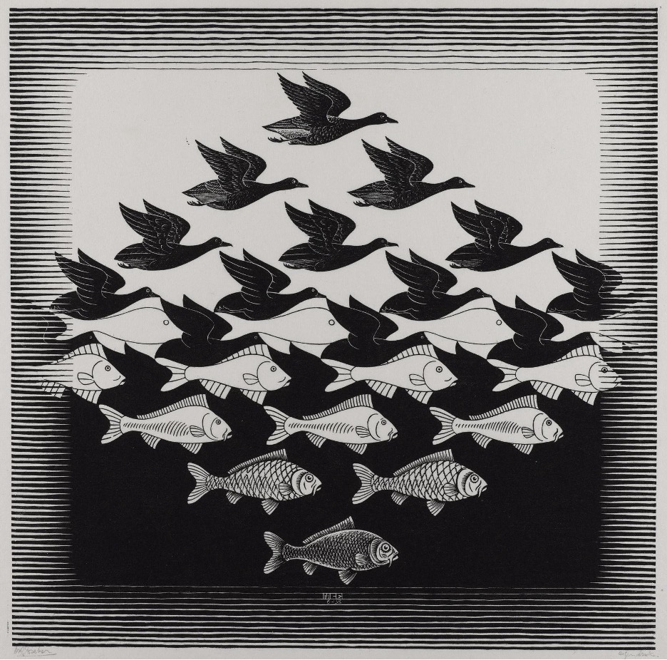
M. C. Escher had an incredible ability to break visual logic. In this piece, birds slowly transform into fish. Or are the fish transforming into birds? That’s exactly the point—you stop knowing what’s figure and what’s ground. It feels less like traditional figure/ground and more like visual metamorphosis, where images overlap and evolve into something else entirely.
Face of Mae West Which May Be Used as an Apartment (1934–35) — Salvador Dalí Couldn’t Stay Out of This Madness
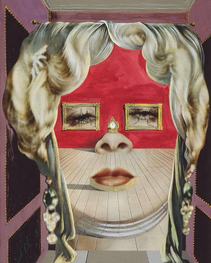
Of course, Salvador Dalí had to be part of this conversation. In this piece, you can clearly see two things happening at once. Unlike the Rubin Vase, it doesn’t feel as ambiguous or optical-illusion driven.
It’s very Dalí—dramatic, surreal, and intentionally bizarre. You first notice a woman’s face. Then you realize:
- the lips are a couch
- the eyes are paintings
- the nose is a fireplace
All Is Vanity (1892) — Not Everything Is What It Seems
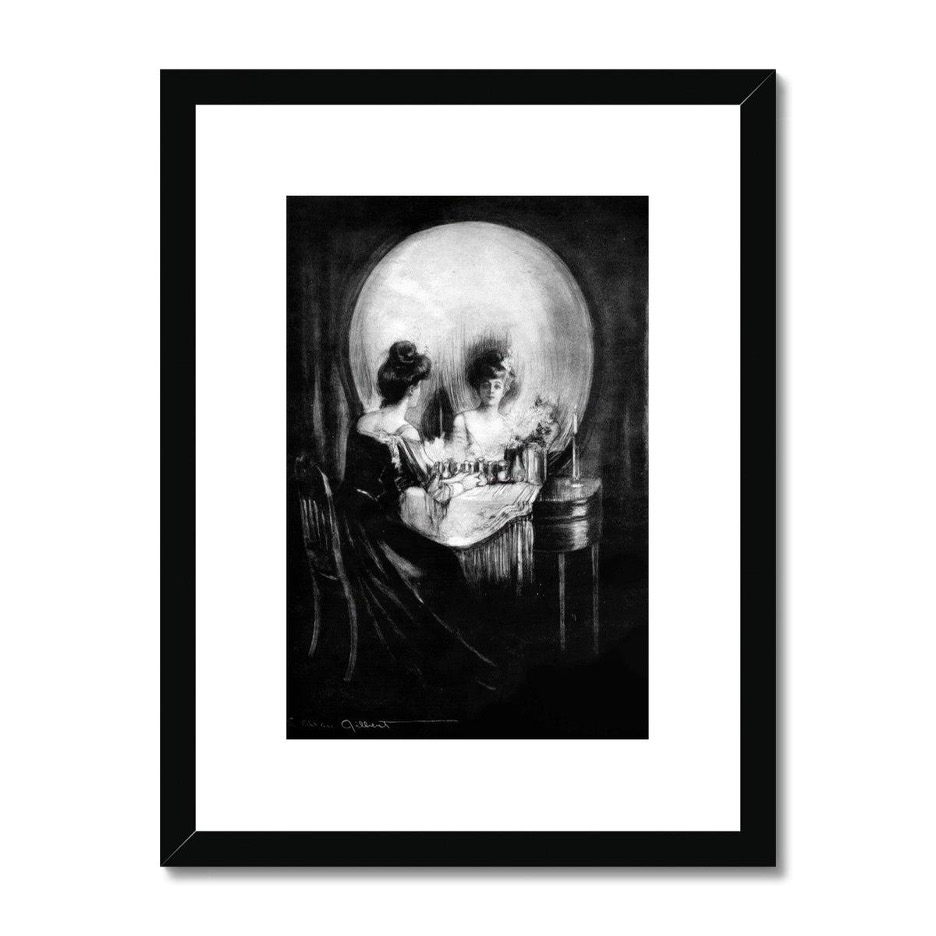
Created by Charles Allan Gilbert, this one feels almost unsettling at first. Your brain immediately notices a skull. A little creepy. Then suddenly you realize it’s actually a woman sitting in front of a mirror.
And that subtle transition is what makes this piece so clever. It goes from dark and dramatic to elegant and delicate in seconds
Works by Octavio Ocampo — Seeing Two Things at Once
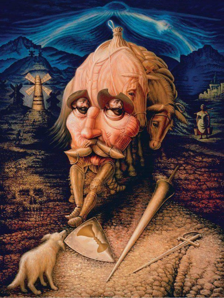
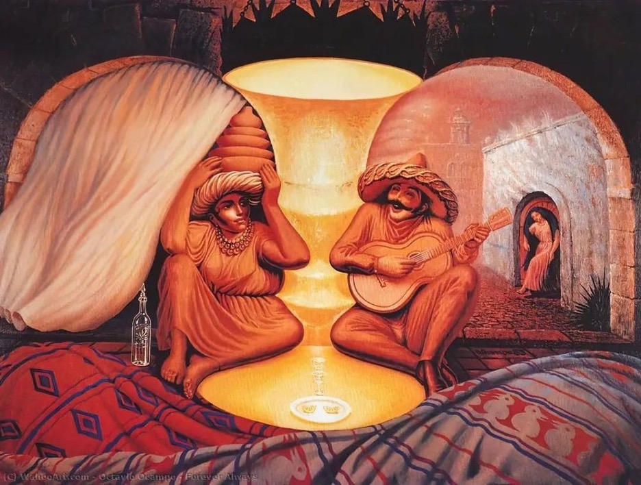
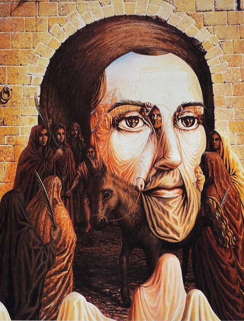
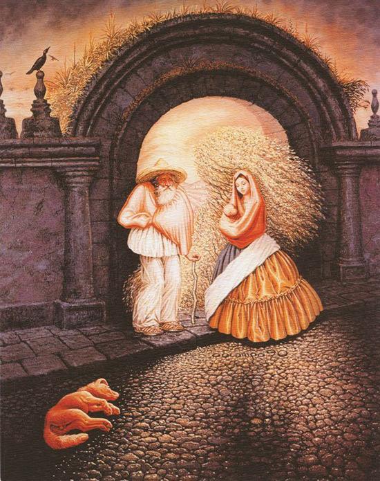
Octavio Ocampo created some of the best examples of layered imagery. This is a great example of clearly seeing two things at the same time—and both are executed incredibly well.
You see one image. Then another. Then another. And suddenly you’re standing there trying to decode everything hidden in the artwork.
FedEx Logo (1994 Redesign) — A Modern Figure/Ground Example
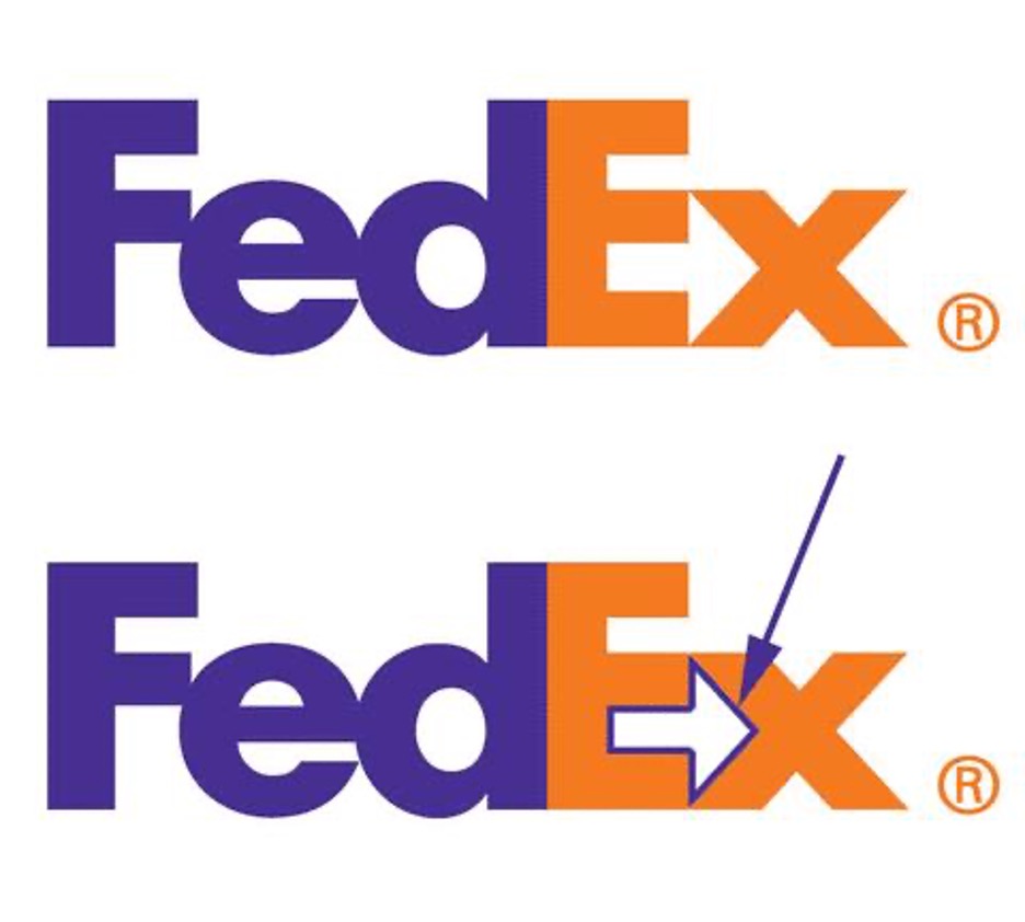
Figure/Ground isn’t stuck in museums—and sometimes it overlaps with another design technique: negative space. One of the most famous modern examples is the FedEx logo. If you live in the U.S., chances are you’ve seen this logo at least once a day while driving around your city.
But many people never notice its hidden secret. Between the letters E and x, there’s a hidden arrow created through negative space.
Unlike the Rubin Vase, your brain isn’t switching between two competing interpretations. You still clearly read the word FedEx first—the arrow is simply a clever secondary discovery hidden in plain sight.
That arrow was designed by Lindon Leader when he redesigned the logo in 1994.
Why Designers Love Figure/Ground (Including Me!)
Because it turns passive viewers into active participants. It makes people stop scrolling.
Look twice. Think harder. And when a design makes people interact with it mentally—even for a few seconds—it becomes unforgettable.
That’s the real power of Figure/Ground.

Leave a comment